13 SVG illustration styles, written by Claude Code and Codex
A reference of 13 hand-written SVG styles on one shared scene, with the prompt for each, the SVG feature that does the work, and what went wrong on the way.
The drawings and most of this text were produced with AI tools. Every drawing is an SVG file written by a coding agent. The notes describe the specific files shown.
My earlier posts ran one bicycle scene through 11 illustration styles and then through two image models. Those outputs are pixels. This one is about vectors: SVG files written as code by an agent, small enough to ship inline and sharp at any width.
I set it up as a lab rather than a comparison. Every style shares one subject and one set of output rules. A Claude Code subagent or a Codex run owned two styles each. It wrote a prompt, generated an SVG from it, rendered it in a browser, looked at the result, and then revised the prompt rather than patching the file. Up to three rounds per style.
This page is the reference I want next time I need a figure. Each entry has the drawing, the SVG feature that does the work, what went wrong, and the final prompt.
How to use this page
- Pick a style from the index below.
- Open its prompt and copy it. Every prompt is self-contained: the subject, the palette, the output rules and the numbered SVG mechanics.
- Swap the nouns for your own subject, and keep the mechanics as written; those took the rounds to get right. I haven’t tested a swap yet. Prompts with fixed geometry will need the most rework: halftone’s per-face tone values, guilloche’s oval and rosette sizes, the paper diorama’s seven-sheet order. Bauhaus, Isotype and the pen plotter describe rules more than a layout, so they should travel better.
- Run it in an agent that can render the SVG and look at it, and expect a second round. Every style here had a problem in round one that only showed up in the render.
Index
| Style | What does the work | Constraints | Size |
|---|---|---|---|
| Risograph | One group per ink, multiply overprint, noise speckle | – | 7.6 KB |
| Ink and wash | Shape minus its own blur for pooled edges | About 12 filter passes | 8.9 KB |
| Halftone | Threshold filter over a dot pattern | Chrome only; not for thumbnails | 6.8 KB |
| Guilloche engraving | Line-screen patterns, <use> rosettes |
– | 15.0 KB |
| Paper diorama | Per-sheet filter: cut edge, fiber, two shadows | – | 7.7 KB |
| Stained glass | Each pane drawn twice; lead from a mask | – | 13.7 KB |
| Pen plotter | Flat faces in a matrix, non-scaling strokes | Needs a script | 23.9 KB |
| Topographic contours | Contoured height field | Needs a script; partial | 16.5 KB |
| Cyanotype | Emulsion mask, screen-blended exposures | – | 8.0 KB |
| Nocturne | Darkness by default, light from masks | Very dark | 8.8 KB |
| Micrography | <textPath> on transformed planes |
Uses text | 14.7 KB |
| Bauhaus poster | One mask for every cutout | – | 4.1 KB |
| Isotype | Counted <symbol> units |
– | 3.3 KB |
Sizes are the final SVG files. Select any drawing to open the SVG itself. Each caption says how the drawing was made: regenerated from its prompt (Codex) or built in a loop where the agent revised the prompt and the file together (Claude Code), so a fresh run from that prompt may differ.
The shared base
Every prompt starts from this subject and these output rules, then adds a style block. The scene is hypothetical.
Subject: A hypothetical city block on a quiet South Florida street: one focus building on its own lot, two or three neighboring buildings, a few round-canopy trees, and a frontage road along the front edge. The focus building is the single point of emphasis.

Output rules:
- One standalone SVG, viewBox="0 0 560 336", xmlns set, no width/height attributes. Under 60 KB.
- No raster images, no external references, no scripts, no animation (it must look complete as a still).
- Put the palette in a <style> block inside the SVG as CSS custom properties on svg { --name: value; } and reference them with var(). 3–6 colors per style.
- No text elements, unless the style is about type.
The palette rule matters more than it looks. Because each file keeps its colors in CSS custom properties, you can retheme a drawing by changing four or five values at the top of the file.
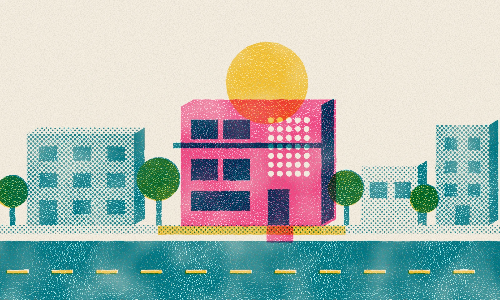
1) Risograph
A three-drum zine print: pink, teal and yellow ink on warm paper, with the pink drum slightly off register.

How it works
- Each ink drum is its own one-color
<g>withmix-blend-mode: multiply. The plum windows, green canopies and orange where the sun crosses the roof are never specified; they come from overprinting. - Misregistration is a small
translateon the pink group (the yellow drum is nudged too). - Ink texture is fine noise thresholded into speckle, multiplied by low-frequency noise for uneven density (
feTurbulenceplusfeCompositearithmetic). - A
<mask>knocks the road centerline and the breeze-block screen out of the ink.
Watch for
- A halftone screen at 15° made the buildings look like they lean, because dot rows clipped at a rectangle edge read as a slanted edge. The prompt fixes the screen at 45° on a 3.5-unit grid.
- The first paper texture read as sandpaper. The prompt now asks for clean paper with the grain only in the ink.
- The top third is mostly empty paper, and the lawn reads as sand.
Risograph prompt
Write one standalone SVG illustration.

Subject: A hypothetical city block on a quiet South Florida street: one focus building on its own lot, two or three neighboring buildings, a few round-canopy trees, and a frontage road along the front edge. The focus building is the single point of emphasis.

Style: a three-drum risograph print, like a small-press zine poster. Fluorescent pink, teal and yellow inks on warm off-white paper. Flat, confident shapes, no outlines, no gradients. Use a frontal street elevation with a shallow right-side face on each building so there is a little depth. The focus building is printed in solid pink; neighbors are teal; tree canopies are teal over yellow so they overprint to green. Where pink and teal overlap they multiply to a deep plum: use that deliberately for the focus building's windows and shaded side. The pink drum is visibly misregistered from the others. Ink has fine grain, slightly uneven density and speckle; paper shows through. The paper itself should read as clean, warm stock, not as noise.

Palette (CSS custom properties on `svg {}` in a `<style>` block, referenced with `var()` through CSS classes, not presentation attributes): --paper #f4eee1, --teal #00839a, --pink #ff4f9a, --yellow #ffd03a.

SVG mechanics:
1. One `<g>` per ink drum (yellow, teal, pink, in that order), each drawing only in its own ink. Most shapes are solid ink; the overprints do the shading. Use halftone dot `<pattern>`s (circles in a 3.5-unit grid, `patternUnits="userSpaceOnUse"`, `patternTransform="rotate(45)"`) for at most two tints, only on secondary surfaces like neighbor facades and the sidewalk. Use 45° only: at shallow angles like 15° the clipped rows of dots along a rectangle edge make the whole building look like it leans, and fine grids moiré. Never use opacity for tints.
2. Every ink group has `style="mix-blend-mode:multiply"` so overlaps darken like real overprint. Offset the pink group with `transform="translate(2.5,1.5)"` and the yellow group by about (-1,1).
3. Ink filter per drum (`filterUnits="userSpaceOnUse"`, region covering the whole 560×336 viewBox, a different seed per drum):
   - edge roughness: feTurbulence at a fairly high baseFrequency (~0.12) → feDisplacementMap at scale ≤1.2. Do not use low-frequency displacement; it bends whole buildings.
   - speckle: fractalNoise baseFrequency ~0.9 → feColorMatrix mapping the R channel to a hard-thresholded alpha so about 8% of the ink drops out.
   - density: fractalNoise baseFrequency ~0.02 → feColorMatrix to alpha in the 0.78–1.0 range.
   - combine speckle × density with feComposite `operator="arithmetic" k1="1"`, then feComposite `operator="in"` with the displaced ink.
4. Paper: a full-bleed `--paper` rect with a filter adding only a faint warm fiber: fine feTurbulence (baseFrequency ~1.1) → feColorMatrix to a warm brown at no more than ~5% alpha, composited over the paper.
5. Where a light ink must print on top of a darker one (road centerline), knock the darker ink out with a `<mask>` and print the light ink in the gap, as a real riso separation would.

Avoid: strokes, gradients, more than three inks, grain heavy enough to look dirty, details smaller than about 4 units that the grain will eat, and halftone on large areas. No text. viewBox="0 0 560 336", xmlns set, no width/height, under 60 KB.
2) Ink and wash
An architect’s pen sketch with loose washes on cold-press paper. The pen lines stay crisp while the color bleeds.

How it works
- The darker, pooled edge of each wash is the shape minus a blur of itself (
feCompositearithmetic withk2=1 k3=-1), gated by low-frequency noise so the pooling comes and goes. - Edges bleed through
feDisplacementMapplus a small blur, and overlapping washes darken with multiply. - The sky is one curved wash faded by an elliptical radial-gradient mask, which leaves a bare-paper halo around the focus building.
- Pen lines get no filter and overshoot at the corners, like a drafting pen.
Watch for
- Say what shape the washes are. Washes that copy the pen outline look like a colored-in diagram no matter what the filter does.
- The model’s default noise settings overshoot: the first paper looked like stucco and the next edges looked like torn paper. The prompt caps noise detail and paper contrast.
- About twelve full-canvas filter passes. Fine for one image; heavy for a long page on a high-density screen.
Ink and wash prompt
Write one standalone SVG illustration.

Subject: A hypothetical city block on a quiet South Florida street: one focus building on its own lot, two or three neighboring buildings, a few round-canopy trees, and a frontage road along the front edge. The focus building is the single point of emphasis.

Style: an architect's ink-and-wash sketch on cold-press watercolor paper. Loose transparent watercolor washes laid first, then a crisp, fine pen drawing on top. The washes are their own loose shapes: they wander 3–8 units off the pen lines, miss corners, leave slivers of bare paper where light hits an edge, and never trace the outline exactly. Each wash dries with a soft darker band of pigment pooled just inside its edge, stronger in some places than others, and a slightly uneven body. Shadows are glazed on as a thin second wash. The focus building carries the only warm color (coral/terracotta, its shaded side a second coral glaze plus a thin blue); everything else is cool, light and quiet, with plenty of untouched paper. Viewpoint: an elevated three-quarter oblique view, front faces toward the viewer and depth receding up and to the right, so roofs, lots and tree shadows are visible.

Palette (CSS custom properties on `svg {}` in a `<style>` block, referenced with `var()` through CSS classes): --paper #f7f3ea, --ink #2a2933, --blue #7aa3c4, --green #93b37d, --sand #dbc8a4, --coral #e2876a.

SVG mechanics:
1. Wash filter (`filterUnits="userSpaceOnUse"`, region a little larger than the viewBox, reused on every wash):
   - bleed: feTurbulence (fractalNoise, baseFrequency ~0.03, numOctaves 3) → feDisplacementMap on SourceGraphic at scale ~10, so straight edges go irregular and shapes drift, then feGaussianBlur stdDeviation ~0.5 so the edge is soft like a wet edge. More octaves or no softening makes edges look like torn paper.
   - pooled edge: feGaussianBlur the displaced shape (stdDeviation ~2.5), then feComposite `operator="arithmetic" k2="1" k3="-1"` (shape minus its blur) to get a band that is strongest at the edge and fades inward; feColorMatrix darkens its RGB ~25% and multiplies its alpha ~2; feComposite `in` against a low-frequency noise alpha (baseFrequency ~0.012) so the pooling comes and goes along the edge.
   - body: the displaced shape at alpha ~0.5, feComposite `in` against a fine granulation noise alpha (baseFrequency ~0.9, mapped to 0.7–1).
   - feMerge body, then pooled edge. Do not use feMorphology for the rim; a constant-width rim looks like an outline.
2. Each wash shape (or group of non-touching shapes of one color) gets the wash filter and `mix-blend-mode:multiply`, so later glazes darken where they overlap earlier ones.
3. Sky: a graded wash. One broad shape whose lower edge runs just above the rooftops in soft curves (dipping between buildings, lifting a little above the focus building to leave a halo of bare paper; no stepped notches or straight cut-outs). Fade it with a `<mask>` holding an elliptical `radialGradient` centered low over the focus building (white at center to black at the rim, wider than tall via gradientTransform), so the blue is strongest at the skyline and dissolves into bare paper above and toward both side edges. No cloud blobs, no rectangular sky.
4. Road: a dry-brush wash. Same filter plus a streak mask: feTurbulence with an anisotropic baseFrequency like "0.006 0.22" thresholded hard into alpha by feColorMatrix and feComposite `in`, so the road wash breaks into horizontal streaks of bare paper.
5. Paper: a full-bleed --paper rect whose filter builds a fine cold-press tooth: feTurbulence (baseFrequency ~0.5, numOctaves 2) → feDiffuseLighting (surfaceScale ~1, feDistantLight elevation ~60) → feComponentTransfer remapping to a narrow 0.97–1.01 range → feBlend `multiply` onto the paper. It should be barely visible, felt more than seen.
6. Pen layer: unfiltered strokes in --ink, stroke-width 0.7–1.1, round caps and joins, `fill="none"`. Lines overshoot corners by 3–5 units; tree canopies are open loops (a circle with `pathLength="100"` and a single dash of ~85 leaving a gap); a few parallel hatch strokes on shaded faces; windows as small rectangles, with the focus building's glazing indicated by pen hatching rather than a dark wash; road centerline with `stroke-dasharray`.

Avoid: wash shapes that copy the pen geometry, opaque fills, heavy or muddy color (blue over coral at full strength turns brown), visible paper texture like stucco, filters on the pen lines. No text. viewBox="0 0 560 336", xmlns set, no width/height, under 60 KB.
3) Halftone
A two-ink newspaper halftone. Every tone is dots that grow as the tone darkens, and the focus building is the only red thing on the page.
How it works
- Each ink gets a grayscale tone map of the scene, drawn with plain shapes and gradients.
- A 5×5 dot pattern made from a cone-shaped radial gradient is laid over the tone map at 50% opacity, rotated 45° for black and 15° for red with
patternTransform. - One
feColorMatrixthresholds the average into hard ink, so dot size follows the tone.feFloodcolors it, and the red layer overprints with multiply.
Watch for
- The gradient stops decide everything. A linear cone lost the light tones and a rough squared one plugged the darks. Exact stops where dot area equals darkness gave the full range, and the prompt lists them.
- Keep the black screen off the red building, or the two inks turn to mud.
- Chrome only, as written. In WebKit (Safari’s engine) the light dots drop out, outlines break into dashes, and the red screen bands. The cause isn’t isolated; the agent’s notes flag
flood-colorset throughvar()and multiply on a filtered group. At thumbnail size (about 110px wide) the dots also merge into solid tone.
Halftone prompt
Draw a hand-authored SVG illustration.

Subject: A hypothetical city block on a quiet South Florida street: one focus building on its own lot, two or three neighboring buildings, a few round-canopy trees, and a frontage road along the front edge. The focus building is the single point of emphasis.

Style: a two-ink print halftone, like a 1960s newspaper photo crossed with a pop-art panel. Every tone in the picture is made of dots on cream newsprint. Dots grow as the tone gets darker: small dots in the sky and on lit faces, fat touching dots on shadow sides, dots that merge into near-solid ink in the deepest shadows. Black key ink carries all the shading. A second ink, warm red, appears only on the focus building, printed as its own dot screen at a different angle, so the building reads as the one colored thing on the page. No hard vector fills anywhere except where a tone is fully black.

Viewpoint: a straight-on street elevation with a shallow oblique depth (each building shows its front face, a narrow right side face, and a thin roof strip, all from one depth offset of about +22, -12). Sun from the upper left, so side faces and cast shadows fall to the right. The frontage road runs across the bottom fifth of the frame as a dark band with a lighter dashed centre line; a thin lit sidewalk and lawn strip sits between road and buildings. The focus building stands in the middle, taller than its neighbours, mid-century modern: flat roof, a cantilevered entrance canopy, ribbon windows. Two neighbours left and right, lower and plainer. Three round-canopy trees between and in front of the buildings, each canopy a shaded sphere with a soft shadow on the ground.

Palette (CSS custom properties on `svg` in a `<style>` block):
- `--paper: #f2e8d2` newsprint cream (the background rect)
- `--key: #1c1a19` black ink
- `--red: #d23a2c` second ink
Grey fills used inside the tone maps are not palette colours: they never print as grey, they only tell the screen how big to make the dots.

SVG mechanics (follow these exactly):
1. Tone map per ink. For each ink, paint the scene in plain greys inside one `<g>`, starting with a full-frame white rect. White = no ink, black = solid ink. Use `linearGradient` and `radialGradient` fills for shading (sky darkening upward, sphere shading on canopies, soft shadow ellipses, falloff on side faces). Dark strokes (tone #000, width 2) on building edges and canopy outlines print as solid key lines; thinner strokes break up into dots, so avoid them. Grey values map roughly to ink coverage: #e0 is a faint screen, #b0 a light tone, #80 a half tone, #50 a heavy tone, #20 near solid. Lit fronts sit around #b0 to #c0, roofs #e0, side faces and window glass #40 to #60, the road #50, the sky a gradient from #a0 at the top to #fff at the horizon. Shadows are simple shapes: a soft radial ellipse under each tree, and a parallelogram on the lawn to the right of each building. The red tone map is white everywhere except the focus building: front face a left-to-right gradient #a0 to #70, side face #30, roof #c0, canopy slab #000, windows and door white. In the key tone map, keep the focus building's front face nearly white (#f0) so only red dots cover it and the two screens do not mix into a muddy rosette there; the key ink on the focus building is limited to its outlines, glass, side face and canopy shadow.
2. Dot screen as a pattern. Define `radialGradient id="cone"` (cx=cy=0.5, r=0.7071) whose value is 1.571 x (offset squared), so a dot's area equals the tone's darkness and ink coverage tracks the grey value linearly (a plain linear cone collapses the light tones to nothing; a plain quadratic one overshoots and plugs the darks). Use exactly these stops: 0 `#000`, 0.3 `#242424`, 0.5 `#646464`, 0.65 `#a8a8a8`, 0.7071 `#c8c8c8`, 0.798 `#fff`. Then a `pattern` with `patternUnits="userSpaceOnUse"`, width=height=5, containing one 5x5 rect filled with the cone. Rotate it with `patternTransform`: 45deg for the key screen, 15deg for the red screen (30deg apart to avoid moire).
3. Average the two. As the last child of each tone-map group, lay a full-frame rect filled with that ink's screen at `opacity="0.5"`. Normal alpha compositing now gives 0.5 x tone + 0.5 x cone, so a pixel should print ink exactly where tone + cone < 1, which makes dot radius grow as the tone darkens.
4. Threshold with one filter per ink (`filterUnits="userSpaceOnUse"`, full frame, `color-interpolation-filters="sRGB"`): `feColorMatrix` with values `0 0 0 0 0  0 0 0 0 0  0 0 0 0 0  -12 0 0 0 6` turns grey into an ink-coverage alpha with a short soft edge; then `feFlood` with `style="flood-color:var(--key)"` (or `var(--red)`) and `feComposite operator="in"` against that alpha.
5. Stack: paper rect, then the filtered key group, then the filtered red group with `style="mix-blend-mode:multiply"`, so red and black overprint like real inks.

Constraints: `viewBox="0 0 560 336"`, xmlns set, no width/height, no text, no raster images, no scripts or animation, under 60 KB. Keep the tone maps simple shapes; the dot screen does the rendering.
4) Guilloche engraving
A banknote or share certificate: the block engraved in green line screens inside an oval, with a rope border and a spirograph rosette.

How it works
- Tone comes from small line patterns (horizontal, vertical, crosshatch, grass ticks). Darker screens fade in over lighter ones through gradient masks set to
objectBoundingBox, so one mask can serve several shapes (here, all three canopies). - The rosettes and the sunburst behind the focus building are one circle, ellipse or line reused many times with
<use>and rotation. - The coin-edge ring around the oval is one ellipse stroke with
stroke-dasharray.
Watch for
- Name the structure, not just the technique. “Phase-shifted sines” gave a sparse chain and then a diamond mesh. It took “two 4-line ribbons half a period apart” to get a twisted rope.
- State the tonal order (neighbors light, focus building dense, road darkest), or nothing stands out.
- Keep line spacing at 2.5 units or more, or the screens turn to gray mush.
Guilloche engraving prompt
Draw a hand-authored SVG illustration.

Subject: A hypothetical city block on a quiet South Florida street: one focus building on its own lot, two or three neighboring buildings, a few round-canopy trees, and a frontage road along the front edge. The focus building is the single point of emphasis.

Style: a banknote or share certificate. The scene is an engraved vignette set into an oval window, the way a bank note shows a building or a landscape, surrounded by a decorative frame of guilloche: interlaced wave bands and spirograph rosettes. Everything is drawn in fine lines only, as if cut by an engraving machine: tone comes from line screens (spacing, weight, direction, crosshatch), never from flat fills. Two security inks on pale paper: a deep green-black for the engraving and a red-brown for the guilloche ornaments, with a pale green tint underprint behind everything. No text, numerals, portraits or seals.

Layout: a double-rule border near the edge, then a guilloche wave band about 14 units wide running all round, with a small rosette medallion at each corner. Inside, an oval vignette (about 390 x 250) left of centre holds the scene; to its right a large circular guilloche rosette (radius about 54, filling most of the panel height left over) sits on the tint underprint, like a note's security medallion.

Scene inside the oval: a street elevation with shallow oblique depth (front face, narrow right side face, thin roof strip from a depth offset of about +16, -9). Sun from the upper left. The focus building stands in the middle, taller, mid-century modern with ribbon windows and a cantilevered entrance canopy; behind it a sunburst of fine rays fans up into the sky, the classic engraving device for drawing the eye. Two lower, plainer neighbours left and right, engraved lighter. Three round-canopy trees. A lawn strip, then the frontage road along the bottom of the oval with a dashed centre line left as bare paper.

Palette (CSS custom properties on `svg` in a `<style>` block): `--paper: #f0ead8`, `--ink: #1d3b31`, `--orn: #8b3a2b`, `--tint: #b9d0c0`.

SVG mechanics:
1. Line screens as `<pattern patternUnits="userSpaceOnUse">` tiles holding one or two `<path>` strokes: light horizontal lines (pitch 3, width 0.45), medium (pitch 3, width 0.8), vertical lines for side faces, a 45-degree crosshatch for the darkest areas (two rotated patterns layered), short vertical grass ticks for the lawn, small looping curls for foliage. Use `patternTransform` to rotate. Keep every pitch at 2.5 units or more so the screens survive at 560 px wide without moire.
2. Graded tone with masks: where a surface needs a gradient (sky fading toward the horizon, the shadow side of each canopy, the right half of each front face), fill the area with a darker line screen and attach a `<mask>` whose content is a rect filled with a `linearGradient` or `radialGradient` from white to black, so the extra lines fade in smoothly over the base screen.
3. The vignette is a `<clipPath>` ellipse applied to the whole scene group; stroke the same ellipse twice (0.8 and 0.4, 3 units apart) as the window's engraved edge.
4. Rosettes by repetition: define one ellipse or circle in `<defs>` and `<use>` it many times with `transform="rotate(a)"` inside a translated group, at even steps, stroked at 0.3 to 0.45 with no fill. The overlap of the copies is what makes the guilloche net. The big rosette layers three families so it reads as a dense lace, not a few loops: 36 circles of radius 22 whose centres sit on a ring of radius 30; 24 ellipses 54 x 18 at 7.5-degree steps; and an inner ring of 24 circles of radius 8 on a ring of radius 12. Finish with two concentric rules at the rim. Use the same method, smaller, for the four corner medallions and the sunburst rays.
5. The wave band is two interlacing ribbons, not an even mesh: a pattern tile 24 wide and 14 high; each ribbon is four sine curves of the same amplitude (5 units, period 24, each written as one `M x 7 c4 -5 8 -5 12 0 s8 5 12 0 ...` path spanning two periods) shifted 1.5 units apart, so the four lines run close together as a flat ribbon; the second ribbon is the same four curves shifted by half a period (12 units). The gaps between ribbons stay open paper, which is what makes it read as a twisted cable rather than a net. Fill the top and bottom band strips with it, and a copy with `patternTransform="rotate(90)"` (via `href` to the first pattern, with its own `y` offset so the tile lines up with the strip) for the left and right strips.
6. The tint underprint is a very fine wavy-line pattern in `--tint` filling the inner panel behind everything.
7. A milled ring around the vignette: stroke an ellipse 7 units outside the oval with `--orn` at stroke-width 6 and `stroke-dasharray="0.5 1.6"`, so the dashes become a ring of fine radial ticks like a coin edge, and bound it with two 0.4 rules (one on each side). It ties the scene into the ornament.

Opaque layering: every line-screen pattern used as a base fill carries its own paper-coloured background rect, so nearer surfaces hide the sky rays and screens behind them; only the masked overlay screens are transparent.

Tone hierarchy (this is what makes the focus building win): neighbours get only the light horizontal screen on their fronts, a light vertical screen on their sides, open crosshatch windows, and no gradient overlay. The focus building gets the medium horizontal screen on its front plus the masked vertical overlay on the right half, a side face of vertical lines with a crosshatch overlay so it goes near-dark, and windows in a tight heavy crosshatch (pitch 2.5, width 1) that read almost black with paper mullions. Canopies are a dense curl texture (tile 4, stroke 0.55) with a crosshatch overlay masked by a radial gradient centred at (0.72, 0.78) of the bounding box with radius 0.85 (white at the centre, black only at the rim), so the lower-right two thirds go clearly dark and each canopy reads as a lit sphere, darker than the neighbour facades. The road is the darkest band in the scene (medium lines plus crosshatch) so the picture sits on a solid base, with the centre dashes as bare paper. Building outlines and window frames are 0.7 to 0.9 strokes in `--ink`.

Constraints: `viewBox="0 0 560 336"`, xmlns set, no width/height, no text, no raster images, no filters, no scripts or animation, under 60 KB.
5) Paper diorama
A lit shadow box of seven stacked paper sheets, with the coral focus building standing further forward than everything else.

How it works
- One filter per sheet does everything:
feDisplacementMapfrom low-frequency noise for hand-cut edges,feDiffuseLightingover noise for paper fiber, and two shadows (a tight contact one and a soft ambient one). - Windows are holes cut by a mask inside the filtered group, so each hole shows the sheet behind with a real shadow on its top and left edges.
- The focus building uses a second filter with a bigger, softer shadow, which is what pushes it forward.
Watch for
- Shadows only read as depth where sheets overlap colored paper. When most shadows fell on empty sky, the depth looked flat, so the prompt requires overlap.
- Keep the fiber texture very faint. Too strong reads as stucco; even the final looks a little like pebbled leather up close.
Paper diorama prompt
Draw this as one standalone SVG.

Subject: A hypothetical city block on a quiet South Florida street: one focus building on its own lot, two or three neighboring buildings, a few round-canopy trees, and a frontage road along the front edge. The focus building is the single point of emphasis.

Style: a layered cut-paper diorama seen straight on, like a lit shadow box. Seven flat sheets of tinted paper stacked from back to front: (1) sky, (2) a far band of distant roofs and three tall palm silhouettes, plus a sun disc and two flat cut clouds high in the sky, all one sheet; the far roofs must top out around 45% of the height and the palm crowns must rise clearly above the neighbouring roofs so this sheet stays visible between and above the neighbours, (3) the neighbouring buildings, (4) a row of round-canopy trees standing in front of the neighbours and partly overlapping them, (5) the focus building on its lot, overlapping the trees beside it, (6) the frontage road with a pale curb strip, (7) a foreground hedge whose top edge is a run of uneven bumps (vary width and height; no regular scallops) that overlaps the lower part of the road and runs the full width. Sheets must overlap the sheet behind wherever possible, so most shadows land on coloured paper, not on empty sky; that overlap is what makes the depth read. Every sheet is a single flat colour, no gradients, no outlines. The focus building is the one warm coral sheet in an otherwise cool, quiet set, and it stands visibly further forward than everything else. Its windows and door are cut-through holes. Keep the road band shallow (about one eighth of the height) so the dark sheet does not dominate.

Palette (CSS custom properties in a `<style>` block on `svg`, used with `var()`): `--sky: #f2e6d4` (cream), `--far: #bcd7cc` (pale mint), `--mid: #79ab9f` (sea green), `--sand: #e3c7a1` (neighbour paper), `--focus: #e2735a` (coral), `--ink: #3a2e3b` (plum, used for shadows and the road). Shades come only from shadow, light and texture, never new hues.

SVG mechanics:
1. One `<filter id="paper">` for normal sheets, in this order:
   a. Hand-cut edge: `feTurbulence type="fractalNoise" baseFrequency="0.06" numOctaves="2"` → `feDisplacementMap in="SourceGraphic" scale="2.5"` (result `cut`). Use `cut` instead of SourceGraphic/SourceAlpha for everything below.
   b. Fibre: `feTurbulence type="fractalNoise" baseFrequency="0.9" numOctaves="2"` → `feDiffuseLighting surfaceScale="0.6" lighting-color="#fff"` with `feDistantLight azimuth="225" elevation="70"`, then `feComposite operator="arithmetic" in="cut" in2="fibre" k1="0.45" k2="0.58"` (grain is visible up close but is never louder than the shadows), then `feComposite operator="in"` with `cut` to keep alpha.
   c. Shadow from the alpha of `cut`: a tight contact shadow (`stdDeviation="1"`, `dx="1.5" dy="2"`, 50%) plus a soft ambient shadow (`stdDeviation="4"`, `dx="4" dy="5"`, 28%), each coloured with `feFlood flood-color="#3a2e3b"` + `feComposite operator="in"`. `feMerge`: ambient, contact, sheet.
   Filter region x/y −10%, width/height 125%.
2. A second `<filter id="paper-lift">` identical except the ambient shadow is `stdDeviation="7" dx="8" dy="10"` at 32% and the contact shadow `dx="3" dy="4"`. Use it only on the focus-building sheet: the larger, softer offset says "this sheet is mounted further from the one behind it". All other sheets use `#paper`. Light is from the upper left, so all shadows fall down and right.
3. Each sheet is its own `<g filter>` painted back to front; all shapes on one sheet live in that one group so the sheet casts one combined shadow. The sky sheet has no filter.
4. Cut windows and the door as real holes with a `<mask>` (white rect, black window rects) on an inner `<g mask>`, with the filter on the outer `<g>`, so each hole reveals the sheets behind and shows a shadow along its top and left inner edges.
5. Lighting over the whole box: after all sheets, a full-size rect with a filter that renders `feDiffuseLighting` (on a flat `feFlood` input, `surfaceScale="0"`, `lighting-color="#fff"`) using `feSpotLight x="140" y="-80" z="420" pointsAtX="300" pointsAtY="200" pointsAtZ="0" specularExponent="2" limitingConeAngle="75"` (a wide cone); paint that rect with `style="mix-blend-mode:multiply"` and opacity about 0.22 so the cream sky stays clean, not grey; the upper left is brightly lit and the lower right corner falls off softly.
6. Finish with a shadow-box frame: an evenodd path (big outer rect minus inner rect inset 6px) in `--ink` at about 45% opacity with `feGaussianBlur stdDeviation="7"`.
Keep shape counts low; round trees are circles or lumpy blobs on short trunks. The craft is in layering, overlap and shadow, not detail.

Output rules: `viewBox="0 0 560 336"`, `xmlns` set, no width/height attributes, under 60 KB, no raster images, no external references, no scripts, no animation, no text.
6) Stained glass
An arched leaded window in jewel tones, with light glowing through the panes.

How it works
- Every pane is defined once and drawn twice. The first
<use>draws the glass. A second copy inside a<mask>(black fill, white stroke) draws only the lead lines you can actually see. - CSS custom properties pass into the
<use>copies, so one pane definition carries its own color. - The lead gets a highlight from
feSpecularLightingand a dark blurred halo underneath. The halo darkens each pane at its edges, which sells light coming through better than any glow did.
Watch for
- The obvious second pass (
fill:nonefor the lead) is wrong: it draws every hidden edge, so sky lines run across the buildings. The prompt names the mask approach and says why. - The glass texture must not darken overall, or the sky goes gray.
- Rectangular buildings make the leading look like a grid. Real windows have irregular hand-cut panes.
Stained glass prompt
Draw this as one standalone SVG.

Subject: A hypothetical city block on a quiet South Florida street: one focus building on its own lot, two or three neighboring buildings, a few round-canopy trees, and a frontage road along the front edge. The focus building is the single point of emphasis.

Style: a leaded stained-glass window of the scene, seen straight on from inside, with daylight coming through it. The window is a wide segmental arch (straight sides, a shallow arched top) set in a dark wall that fills the rest of the frame. Inside: a pale sky broken into large irregular facets that fan out from an amber sun in the upper right (the facets start at the sun's rim, not its centre); neighbour buildings in cobalt; the focus building in ruby, the only red, with small amber window panes; round tree canopies in emerald, each canopy cut by one or two gently curved leads that cross it off-centre (never radial wedges from the middle, which read as a logo); a band of emerald lawn; the frontage road along the bottom in deep cobalt with an amber centre line. Every pane is separated from its neighbours by black lead came. Cames vary in width the way real leading does: the window border is heaviest, the outlines of the main shapes are medium, the internal subdivisions of a shape are thin. Adjacent panes of the same colour must differ slightly in tone, as cut glass from different sheets does.

Palette (CSS custom properties in a `<style>` block on `svg`, used with `var()`): `--pale: #f4ead0` (clear cathedral glass), `--amber: #eeb23a`, `--ruby: #b5233a`, `--cobalt: #2452a6`, `--emerald: #1f8a5b`, `--lead: #1b1a1f`.

SVG mechanics:
1. One geometry, two passes. Define every pane once inside `<defs><g id="panes">`. Each pane path gets its colour and its came weight from inherited custom properties only: in CSS, `#panes path{fill:var(--glass-on, var(--c)); stroke:var(--came, none); stroke-width:var(--w, 2.5); stroke-linejoin:round}`, with per-pane `style="--c:var(--ruby)"` and `style="--w:5"` on main outlines. Paint panes in back-to-front order (sky facets, sun, buildings, trees, lawn, road) so later panes cover earlier ones. Render `<use href="#panes"/>` once as glass (no overrides). For the lead, do NOT render a second `<use>` with `fill:none` — that would show every edge hidden behind a later pane (sky facet lines would run across the buildings). Instead put `<use href="#panes" style="--glass-on:#000; --came:#fff"/>` inside a `<mask>`: each later pane's black fill erases the hidden edges of the panes behind it, leaving white only on visible edges. Then fill a full-size rect with `--lead` through that mask. Custom properties inherit into the `<use>` shadow tree, which is what makes the two passes share one geometry.
2. Tone variation: give same-colour neighbouring panes slightly different fills with `color-mix()`. Saturated colours: `color-mix(in srgb, var(--cobalt) 80%, white)` or `... 84%, black)`. The pale sky must stay luminous: vary it only toward amber (`color-mix(in srgb, var(--pale) 80%, var(--amber))`) or toward cool (`... 90%, var(--cobalt)`), never toward black or grey. Roughly a third lighter, a third darker, a third plain.
3. Glass texture: on the glass pass, a filter that adds `feTurbulence type="fractalNoise" baseFrequency="0.035 0.05" numOctaves="3"` → `feColorMatrix` to a grey ramp → `feComposite operator="arithmetic"` with `SourceGraphic` (k1≈0.6, k2≈0.7, so the mottle averages to no change in brightness: a mottle that darkens the glass turns the pale sky grey), then `feGaussianBlur stdDeviation="4"` of the result blended back with `feBlend mode="screen"` at low strength so light bleeds a little over the edges (halation).
4. Light through the glass: over the glass pass and under the lead, a `radialGradient` centred on the sun with radius about 200 (white at 0 opacity 0.85 → amber at 30% opacity 0.35 → transparent at 100%) with `mix-blend-mode:screen`, so the sky around the sun glows. Then lift the whole glass pass toward backlit luminance with `feComponentTransfer` (`feFuncR/G/B type="gamma" exponent="0.8"`) at the end of the glass filter. The cobalt and ruby panes must stay deep and saturated; if a building looks washed out or grey, the glow is too big.
5. Rounded lead and edge falloff: on the lead pass, a filter that first makes a falloff halo (`feGaussianBlur in="SourceAlpha" stdDeviation="3.5"`, flooded `--lead` at 45%) merged under the came, so every pane is darker where it meets the lead and brightest at its centre, which is how backlit glass actually looks; it then blurs `SourceAlpha` (`stdDeviation="1.2"`), lights it with `feSpecularLighting surfaceScale="3" specularConstant="0.9" specularExponent="18" lighting-color="#fff"` and `feDistantLight azimuth="235" elevation="40"`, composites it `in` `SourceAlpha`, and adds it to the lead with `feComposite operator="arithmetic" k2="1" k3="0.35"`: dull grey-black came with a faint highlight running along each strip.
6. Apply the lead filter to a `<g>` wrapping the masked rect (so `SourceAlpha` is the came network). Clip both passes to the arch with a `<clipPath>`; draw the wall in `--lead` with a slightly lighter inner reveal, and the arch border as the heaviest came (`stroke-width` about 9).

Output rules: `viewBox="0 0 560 336"`, `xmlns` set, no width/height attributes, under 60 KB, no raster images, no external references, no scripts, no animation, no text.
7) Pen plotter
An isometric pen-plotter print in one fine pen: black for the block, red for the focus building, no fills anywhere.

How it works
- Each face is drawn flat inside a
<g transform="matrix(...)">, so hatching is just straight runs inside a rectangle. vector-effect: non-scaling-strokekeeps every line the same pen width whatever the skew or display size.- Windows are holes cut out of the hatching by masks (one thick dashed stroke per floor). The lawn is rows of dots from
stroke-dasharray, and trees are concentric rings that bunch up on the shaded side.
Watch for
- Scope
non-scaling-stroketo the drawing group. When it also reached the mask contents, the window holes quietly shrank to almost nothing. - On lit walls the hatching runs the same way as the window rows, so the windows read as dashes. Vertical hatching there would probably fix it (untested).
- The geometry came from short Python scripts, which the prompt asks for. This is not a one-shot chat prompt.
Pen plotter prompt
A hypothetical city block on a quiet South Florida street: one focus building on its own lot, two or three neighboring buildings, a few round-canopy trees, and a frontage road along the front edge. The focus building is the single point of emphasis.

Style: a pen-plotter print, as if an AxiDraw drew it with a 0.3 mm fineliner on warm cream paper. Isometric view (true 30° axes), seen from the front-left, the frontage road running diagonally along the lower-left edge. Every mark is a line. There are no filled shapes anywhere except one paper-colored rectangle behind everything. Tone comes only from line density, the way a plotter makes it.

Palette, as CSS custom properties on `svg` in a `<style>` block: `--paper: #f4f0e6; --ink: #1c211c; --accent: #c8432a;`. Two pens: the focus building is drawn entirely in `--accent`; everything else is `--ink`.

SVG mechanics (compute the geometry with a short script if you can; the output must be plain static SVG):

1. Pen discipline: one root group with `fill="none"`, `stroke-linecap="round"`, `stroke-linejoin="round"`, stroke-width 0.6 for hatching and 0.9 for outlines. No `<pattern>`, no gradients, no filters.
2. Faces as flat drawings under `matrix()`: draw every wall in its own elevation coordinates (u along the wall, v up) and every roof and the ground in plan coordinates, inside a `<g transform="matrix(a b c d e f)">` that maps that flat rectangle onto its isometric face. Hatch lines are then plain horizontal or vertical runs inside a rectangle. Keep one pen width everywhere: set `vector-effect: non-scaling-stroke` in the `<style>` block for the visible drawing only (it is not inherited, so scope it to the drawing group, e.g. `.pen path,.pen rect,.pen circle{vector-effect:non-scaling-stroke}`), so walls, roofs, ground and trees all draw at the same physical line width whatever the skew or display scale. Never let that rule reach `<mask>` or `<clipPath>` contents: mask strokes must stay in local units so window holes keep their size. Use a `<clipPath>` (in the same local coordinates) only for non-rectangular regions such as shadows. Tone ladder: roofs unhatched (neighbors) ; lit front-left walls spacing 3.5; shaded front-right walls spacing 2 plus a vertical cross-hatch at spacing 3; cast shadows on the ground spacing 2.2 (dense enough to read as shadow, open enough to stay line work). Outline every face once on top.
3. Windows as holes in the hatching: each wall's hatch group also takes a `<mask>` (white rectangle, then thick black lines along each floor with `stroke-linecap="butt"` and a `stroke-dasharray` such as `4 3`), so window openings are rows of gaps where the pen lifted. Make each window hole at least two hatch spacings tall so it interrupts two or more lines and reads as an opening, not a dash; on lit walls, where the hatch is open, that means holes about 6 to 7 units tall.
4. Hidden-line removal with `<mask>`: since nothing is filled, anything behind a nearer building or tree must be masked out by that object's silhouette (black polygon / circle in the farther object's mask). Ground marks are masked by every object.
5. Concentric offset fills: the focus building's roof is filled with concentric inset copies of its rhombus (step about 2 units) in accent. Each tree canopy is a set of concentric circles whose centers drift progressively away from the light (toward the lower right), so rings crowd on the shaded side and read as a sphere; a short trunk line below and a hatched elliptical ground shadow.
6. Neighbor roofs stay unhatched paper but carry one inset parapet line about 2 units inside the edge.
7. `stroke-dasharray` for texture: the lawn is rows of dots (`stroke-dasharray="0 5"` with round caps) parallel to the street; the road is close parallel lines (asphalt tone) with a dashed center line and solid curbs; the focus lot's boundary is a dash-dot line.

Light comes from the left: front-left walls lit, front-right walls dark, shadows fall back and to the right. The focus building is clearly the tallest and sits on its own marked lot, centered. Framing: compute the projected bounding box of everything you draw (road, ground, building tops, tree canopies), then choose the isometric scale and origin so that box is centered in the viewBox with at least 24 units of margin on every side; the drawing should fill the sheet, not drift to one corner.

Output: one standalone SVG, `viewBox="0 0 560 336"`, `xmlns` set, no width/height, under 60 KB, no text, no raster, no script, no animation.
8) Topographic contours
The block as a contour map in plan view. Buildings are plateaus, and the focus building is the red summit.

How it works
- The scene is a computed height field: buildings are flat-topped plateaus with sloping skirts, and contours come from a marching-squares script.
- Only contours above the tallest neighbor’s roof are drawn in the accent color, so the focus building alone is red.
- Cliff ticks along the walls are one wide dashed stroke clipped by an even-odd
<clipPath>, so only the outward half of each tick survives.
Watch for
- The result depends on the height model, not on SVG. Smoothing the contours pulled them onto the roofs, so the final uses a finer grid instead.
- Partial result. Trees added as small bumps on a slope only bend the contours, so three of four trees disappeared in the final round. Round 2 still had them, with stray contours across two roofs.
- It needs a script. It can’t be done well by hand.
Topographic contours prompt
A hypothetical city block on a quiet South Florida street: one focus building on its own lot, two or three neighboring buildings, a few round-canopy trees, and a frontage road along the front edge. The focus building is the single point of emphasis.

Style: a topographic survey sheet. Plan view, north up, the frontage road running left to right along the bottom edge of the sheet, its lower curb close to the frame. The whole scene is treated as terrain and described only by elevation contour lines, with the restraint of a USGS quad: no fills, no shading, no labels. Buildings are flat-topped plateaus with steep sides, trees are small round knolls, the ground is a gentle slope rising away from the street, and the focus building is the summit, the highest ground on the sheet.

Palette, as CSS custom properties on `svg` in a `<style>` block: `--paper: #f2efe6; --contour: #a07a52; --index: #6b4a2b; --ink: #1f231f; --accent: #c8432a;`.

SVG mechanics (compute the contours with a short script; the output must be plain static SVG):

1. Height field: define elevation H(x, y) over the 560 × 336 sheet as the sum of (a) the ground: a rise of about 10 units from the road to the back of the block plus one slow sine undulation (amplitude about 2) so several ground contours wander across the sheet; (b) one apron per building outside its footprint, `h × (1 − d/44)^1.6` where d is the distance from the footprint (zero beyond 44), so slopes are steepest at the wall and spread outward, and neighboring aprons add up into saddles between buildings; (c) a small Gaussian knoll per tree. Inside each footprint, override H with one flat value: the maximum H reaches along the outside of that footprint's outline (sample the outline about 0.5 units out). The roof is then the highest flat ground there and no contour can enter it. Heights: focus 44, neighbors 12 to 20, trees 6.
2. Contours by marching squares: sample H on that grid, extract iso-lines every 2 height units, chain segments into polylines, simplify (Ramer-Douglas-Peucker, tolerance about 0.3) and write plain `M`/`L` polylines with 1-decimal coordinates. Sample on a 2.5-unit grid so they look smooth with round joins. Do not spline-smooth simplified polylines: a midpoint B-spline cuts the corners of the tight rings around buildings and pulls them onto the roofs. All intermediate contours go in one `<path>` (stroke `--contour`, width 0.5); every fifth level is an index contour in a second `<path>` (stroke `--index`, width 1.1). `stroke-linejoin="round"`, `fill="none"`.
3. Summit emphasis by level, not by decoration: every contour above the tallest neighbor's height is drawn in `--accent`, so only the focus building's upper slopes and summit carry color. Mark the summit's flat top with a small spot-height triangle (three lines) and a cross.
4. Escarpment ticks from a dashed stroke: trace each building footprint with a wide stroke (width about 4) that uses `stroke-dasharray="0.7 2.3"` and butt caps, clipped by an even-odd `<clipPath>` (sheet rectangle minus the footprint) so only the outer half survives: a comb of short downhill ticks along the wall, the cartographic cliff symbol. Draw the footprint edge itself as a thin `--ink` line.
5. Cultural features in `--ink`: the road as two solid curb lines with a dashed center line (`stroke-dasharray="10 6"`); contours stop at the road, using a `<clipPath>` that excludes the roadway. The focus lot boundary is a thin dash-dot line.
6. A neat line frame inset 10 units, and a quiet graduated border just outside it made from one stroke of width 2 with `stroke-dasharray="20 20"`.

Output: one standalone SVG, `viewBox="0 0 560 336"`, `xmlns` set, no width/height, under 60 KB, no text, no raster, no script, no animation.
9) Cyanotype
A sun print: the block appears as pale exposed silhouettes on Prussian blue, as if cut paper had been laid on the emulsion.

How it works
- The blue emulsion sits inside an irregular, slightly displaced alpha mask, exposing a warm paper margin.
- The focus house is an even-odd silhouette with real transparent window, door and porch openings, so the blue shows through.
- Contact halos and small offset exposures build the pale form with screen blending. Trees overlapping houses add exposure instead of covering them.
Watch for
- A plan view looked like a blue map, even with good edges. Switching to an elevation made the photogram metaphor read.
- The narrow glowing fringes and even blue bath still feel a bit digital.
Cyanotype prompt
A hypothetical city block on a quiet South Florida street: one focus building on its own lot, two or three neighboring buildings, a few round-canopy trees, and a frontage road along the front edge. The focus building is the single point of emphasis.

STYLE — CYANOTYPE / CONTACT PRINT OF A STREET
Create a handmade architectural photogram in frontal elevation, as if translucent cut-paper houses and round foliage had been laid on a sensitized sheet and exposed to the sun twice. A luminous focus bungalow sits near the center, about x=207..375 and y=126..240, with a broad low hipped roof, a shaded porch, and a few dark rectangular openings. Its bright contact silhouette, rather than any stroke outline, must make it the single point of emphasis. Two lower neighbors stand to its left and right, with a third slightly taller rear building partly hidden behind the focus's right roof edge. Show quiet gaps between the houses and ground them on a shared baseline near y=242. Three round-canopy trees at unequal heights partly overlap the smaller neighbors; double exposure should make these overlaps paler. The frontage road crosses the lower edge near y=263..284, as an extremely faint blue exposure band with only a few pale broken center marks. No perspective, no labels, no people, no cars, no diagram arrows, no border line.

The sheet is warm uncoated paper, with a painted Prussian-blue emulsion patch approximately x=28..532, y=25..311. Its slightly ragged brush perimeter has narrow integrated bristle gaps and occasional dry tips. Never add detached parallel strokes or an ornamental frame. The blue should have very gentle broad tonal variation, not a digital grain overlay. Give the composition generous breathing space above the roof and below the road. Use only these five colors, declared on svg as CSS custom properties and referenced with var(): paper #eee7cf; Prussian #073c67; deep #052a50; cyan #579eb9; exposed #e1efdf. All other tones must be transparent mixtures of this palette.

The focus house is mostly pale exposed paper, with subtle uneven cyan contact tones across its large roof and walls. Its silhouette has a slightly irregular contact edge, a very narrow soft cyan fringe, and a secondary exposure shifted 7 units horizontally and -4 vertically. The ghost must be localized and soft, not a sharp offset outline. Use dark blue holes for the few windows, entrance and the narrow porch shadow; make these actual negative-space apertures in the silhouette mask. No drawn roof seams, no inset borders, no uniform linework. A faint horizontal gap can separate the low roof from the facade. Keep the roof and wall connected into a readable, substantial silhouette. Neighbor silhouettes should be roughly half the exposure strength and simpler, so their shapes quietly recede. Tree crowns must be continuous rounded silhouettes with irregular circular lobes only at the perimeter, soft radial contact variation inside, and a few tiny blue pinholes. No bubble clusters, no leaf icons, no drawn branch diagrams. A trunk can be a very thin exposed strip.

Use exactly these six families of SVG mechanics: (1) a hand-shaped alpha mask with low-amplitude filter displacement for the brushed blue emulsion; (2) radial gradients for large exposure washes and continuous canopy contact tones; (3) Gaussian blur and subtle displacement for the narrow contact halos and irregular silhouette edges; (4) screen-blended groups for additive double exposures and overlapping translucent objects; (5) a reusable symbol for the round canopy, placed at three different sizes and rotations; (6) an even-odd aperture mask for the house's negative windows and porch, plus a clipPath limiting the uneven exposure wash to the focus silhouette. Every mechanic must contribute to the optics of a sun-print. The result should feel like a physical photographic contact print, not a clean vector neighborhood illustration recolored blue.

Return a standalone hand-authored SVG only: xmlns="http://www.w3.org/2000/svg", viewBox="0 0 560 336", no width or height attributes on the root, no raster images, external references, scripts, animation, or text elements. Under 60 KB. It must look complete as a still.
10) Nocturne
The block at night from an isometric view. You see only what the light touches: a lit doorway, a few windows, two streetlight pools.

How it works
- Darkness is the default. Radial alpha masks reveal each neighbor locally and the focus building’s two walls at different strengths.
- Separate screen-blended layers add the entrance spill, window cores and road pools.
- Ground geometry and lighting share one isometric matrix, so round light pools land as correctly oriented ellipses. Clips keep light from crossing surface edges.
Watch for
- Darkening the palette isn’t enough; that gives a dim massing model. Mask the whole neighborhood and let the light decide what exists.
- It is very dark. On a light page it reads as a black rectangle until you look closely.
Nocturne prompt
A hypothetical city block on a quiet South Florida street: one focus building on its own lot, two or three neighboring buildings, a few round-canopy trees, and a frontage road along the front edge. The focus building is the single point of emphasis.

STYLE — NOCTURNE / LIGHT REVEALS THE BLOCK
Create an exquisite, restrained architectural night study, viewed isometrically, on a full-bleed blue-black field. The block should occupy most of the middle of a 560 × 336 composition, with breathing room above and below. Use an isometric ground projection with axes (0.866, 0.5) and (-0.866, 0.5), a block about 230 × 190 ground units, and a diagonal frontage road along its nearest edge. The focus is a low, flat-roofed building with a roughly 72 × 65 footprint and 52-unit height, near the front center of the block. Place three smaller, lower neighbors behind and to either side. Three round-canopy trees should read as almost-black spheres with only a crescent or a few leaves caught in light. Arrange the scene with clear space between footprints; draw in coherent back-to-front order. No labels, borders, stars, moon, people, cars, or decorative marks.

Palette, declared on svg as CSS custom properties and referenced with var(): ink #060e1b; structure #102436; slate #244657; cool #6fbbd1; amber #ffb967; light #fff1cb. Limit the scene to these six colors and their transparent mixtures. Most building planes should be barely distinguishable from the background. The focus roof is muted slate, not a bright white tile. Its entrance and a small rhythm of recessed windows are the hottest lights. Give the focus a warm gradient glow that grazes its two visible walls and spills into a broad, soft trapezoid on the forecourt. Keep neighbors at least three times quieter; only one or two tiny cool windows per neighbor. Two slender streetlights on the near sidewalk cast large amber ellipses onto the road. Their ground pools must follow the isometric road plane, with tiny bright sources and long gentle falloffs. Subtle cool reflected light may define one roof edge. The road has no bold outline; its center marks are nearly lost in darkness. Preserve rich dark negative space between every pool of light.

Use these six SVG mechanics deliberately: (1) radial-gradient alpha masks that reveal colored facade planes only near light sources; (2) screen-blended groups for every additive light contribution, including the ground pools and the warm forecourt spill; (3) a clipPath on the focus walls and another on the road so illumination cannot bleed outside the correct surfaces; (4) ground ellipses and site geometry in the same isometric matrix transform, while vertical architecture remains vertical; (5) a reusable window symbol, transformed to each wall's correct plane, with soft glow and a crisp small luminous core; (6) broad radial-gradient atmosphere with very low opacity, avoiding conspicuous outlines or uniform illumination. Softness must come from continuous gradient falloff, with a small Gaussian blur only for lamp/window halation. The silhouette should resolve from illumination, not linework.

Return a standalone hand-authored SVG only: xmlns="http://www.w3.org/2000/svg", viewBox="0 0 560 336", no width or height attributes on the root, no raster images, external references, scripts, animation, or text elements. Under 60 KB. It must look complete as a still.

LIGHTING CALIBRATION — Essential: do not draw the block as a uniformly visible massing model. Remove continuous bright roof outlines, curb outlines, and rooftop equipment. Blend the ground perimeter into the field using a broad radial alpha mask. Apply illumination masks to the complete neighboring building groups too, so their unlit ends dissolve into the blue-black. Neighbors should be readable chiefly as silhouettes and isolated window pairs. The focus roof should receive a faint, localized wash, not a flat slate fill. Its entrance can illuminate the near half of the front wall; the distant wall corners must fall back into darkness. Enlarge the road pools: a soft plateau within the central 20%, with a much wider, very faint amber penumbra. Make the porch spill a broad luminous wedge in the shared ground projection. Do not make the trees glossy spheres; use dark round silhouettes with a slim, partial crescent on the side nearest a lamp. Keep bright cores small and warm. The finished image should feel discovered in darkness, with a hierarchy of entrance → pools → windows → barely inferred architecture.
11) Micrography
The block drawn entirely in text. Words like roof, parcel, setback and frontage are the surfaces, trees are spirals of “canopy · shade”, and the road is rows of “avenue”.

How it works
- Whole phrases sit on invisible
<textPath>guides. Affine transforms put the type on the roof, front and side planes, andtextLengthfits each run so no word is clipped. - Tree canopies are text on shrinking semicircular arcs, reused at three sizes with
<use>. - Windows and the entrance are spelled out (“window”, “door”, “entry”) instead of drawn.
Watch for
- Direction is part of the typography. Runs drawn in the wrong direction come out upside down, so the prompt sets a rule for every baseline.
- End runs short of corners. Where two faces meet, words collide.
- Tiled fill text (the first attempt) chops words at the edges and reads as a rendering bug.
Micrography prompt
A hypothetical city block on a quiet South Florida street: one focus building on its own lot, two or three neighboring buildings, a few round-canopy trees, and a frontage road along the front edge. The focus building is the single point of emphasis.

Create an axonometric micrograph: all visible architecture, lot boundaries, canopies, and road are made entirely of whole words on textPaths. Only the paper background may be a solid visible shape. Use ui-monospace, monospace; four colors: paper #f3efe3, ink #284138, teal #1d7973, ochre #ac733e. No visible caption, legend, heading, detached labels, strokes, filled scene geometry, pattern tiles, clipped letters, or masks. Put hypothetical status in accessible metadata only. The building and road planes should be convincing before the vocabulary is read.

Preserve this oblique composition: focus roof corners (225,62),(393,118),(297,190),(129,134), walls descending 34 units. Its own lot has corners (209,24),(441,101),(309,252),(77,175). Two small neighbors have roofs (77,67),(143,89),(107,116),(41,94) and (437,168),(507,191),(471,218),(401,195). Three inward-spiral canopy trees sit at (63,174),(464,76),(367,219), with radii about 24,26,18. An oblique frontage road runs from (24,222)–(536,286) along its upper edge to (24,254)–(536,318) along its lower edge.

Reading direction is a hard constraint on every straight run: in final canvas coordinates it must read left-to-right, or bottom-to-top for a vertical line. Do not run words around a closed perimeter. Author each edge as an independent open path, reverse the baseline where needed, and never reflect glyphs. Circular canopy spirals are the sole intentional exception to the straight-run direction rule. Use positive-determinant affine transforms. Keep all edge runs and fill runs short of corners: 12 local units at the focus building, 6–8 units at neighbors. Shorten phrases to fit the usable length, rather than squeezing long strings into corners. No duplicate text atop a shared roof/wall edge.

Focus roof: local 192 by 96 plane with matrix(.875 .2916667 -1 .75 225 62). Parallel rows of 5 px semibold text at y=10,18,26,34,42,50,58,66,74,82. Each row starts at x=12 and ends at x=180. Leave a terrace at local x=70–122,y=30–66: split the middle five rows into separate complete phrases on x=12–62 and x=130–180. Trace the four terrace edges with small words on correctly directed open baselines, with generous corner gaps. Roof outline is 6.8 px bold words. Both horizontal roof-edge baselines run toward increasing local x; both slanted side-edge baselines run toward decreasing local y. All outline endpoints are at least 12 local units from roof corners. Use textLength with lengthAdjust="spacing" to fit complete phrases; no clipped fill or missing letter fragments.

Focus front face: matrix(.875 .2916667 0 1 129 134), 192 by 34. Give it four small windows signaled entirely by separate complete runs of the word "window" at y=10, on local intervals x=12–44,52–84,108–140,148–180. Keep an entrance void at x=88–104,y=14–34: two frontage/parcel rows at y=20,28 are independent left and right runs, stopping at x=82 and restarting x=110. Continue this entrance gap through the bottom edge. Trace its sides and lintel with small upright "entry" or "door" words; no solid door icon. The facade thus has recognizable fenestration and a gap reaching the ground, while remaining entirely type. Front base runs read left-to-right, vertically oriented edge/door words read bottom-to-top. Use 5 px semibold wall fill, 6.4 px bold base type. On the right face, matrix(1 -.75 0 1 297 190), use 5 px type rows at y=12,22 on x=10–86, and a 6.4 px bottom run reading toward increasing x. Right vertical-edge words read bottom-to-top and stop clear of both corners.

Both neighbors must be complete three-plane buildings, not ghost roofs. Use 60% ink opacity, regular 3.7 px fill type, 4.6 px outline words, and 22-unit wall heights. Construct each small roof in a 66 by 36 local plane; fill with three rows at y=10,20,30 on x=8–58. Both horizontal edges run toward increasing local x, both slanted sides toward decreasing local y, with 8-unit corner gaps. Add a front wall with two upright rows including "window" and "frontage", a bottom edge, and a right wall with two short rows and its own bottom/outer edge. Use the appropriate positive-determinant roof/front/right-face transforms so all three planes meet. For the first building use roof matrix(1 .3333333 -1 .75 77 67), front matrix(1 .3333333 0 1 41 94), side matrix(1 -.75 0 1 107 116). For the second use roof matrix(1.0606061 .3484848 -1 .75 437 168), front matrix(1.0606061 .3484848 0 1 401 195), side matrix(1 -.75 0 1 471 218). Assign fill and outline classes directly inside reusable definitions so use-cloned text retains its intended size. Keep the large, darker focus unmistakably dominant.

Write the lot in quiet 5.5 px ochre vocabulary on four separate paths, with gaps at every corner. Direct top edge from upper left to upper right, lower edge from lower left to lower right, and both rising edges from bottom to top; every run then has positive canvas x direction. Three reusable canopy/shade spirals in teal supply both circular outline and interior texture without clipped fills. The road is one continuous teal material: in matrix(1 .125 0 1 24 222), use five left-to-right parallel runs across x=6–506,y=0,8,16,24,32, with 7 px edge type and 4.8 px interior type. No separate center labels. Plausible vocabulary throughout: roof, parcel, lot, setback, frontage, terrace, open, window, entry, door, canopy, shade, avenue, sidewalk.

Use four principal SVG mechanics: independent invisible writing paths with textPath; positive-determinant affine transforms aligning text with surfaces; textLength fitting complete phrases on finite baselines; use repetition for three-plane neighbors and inward-spiral canopy text. Output one standalone SVG with xmlns, viewBox="0 0 560 336", no root width/height, under 60 KB. Define the four palette colors as CSS custom properties on svg in an internal style block, referenced with var(). No images, external references, fonts, scripts, animation, filters, or external model/API calls. Text elements are expressly permitted for micrography.
12) Bauhaus poster
A Bauhaus poster: an oversized red facade bleeding off the edge, small primary-colored neighbors as counterweights, circle trees, a diagonal road.

How it works
- One
<mask>cuts both the quarter-circle terrace and the square windows out of the red facade. - The colored quarter on each round tree crown is one quarter-circle path reused at different scales and rotations.
- The road is a rectangle with a clipped lane-mark pattern, rotated −8°. About 4 KB in total.
Watch for
- The first try was three boxes in a centered row, which is an icon set, not a poster. Asymmetry needed scale, cropping and a diagonal.
- The next try was bold but lost the street. A few unmistakable nouns (a row of windows, a door reaching the ground, a tree trunk) bring it back.
Bauhaus poster prompt
A hypothetical city block on a quiet South Florida street: one focus building on its own lot, two or three neighboring buildings, a few round-canopy trees, and a frontage road along the front edge. The focus building is the single point of emphasis.

Make an assertive Bauhaus / Swiss geometric street poster: enormous red anchor, asymmetric small counterweights, unequal circular trees, forceful black diagonal. It must read as a city block within one second. Use a compressed street-elevation collage, with upright building facades on staggered sites above the road. Keep the abstraction spare, but give buildings square windows and ground-reaching doors, and give every circular crown a thin rectangular trunk. Use exactly five flat colors: warm paper #f2eddc, black #161a18, red #db3328, yellow #f4c52d, blue #2448a0. No visible text. Describe the hypothetical scene in accessible title/description only. An 8-unit grid governs architecture; half-grid positioning is allowed for centered thin trunks and lot boundary bars.

Keep one huge red focus building at x=-32–256,y=24–240, cropped by the left canvas edge. Its own lot has an open-ended black boundary at x=280,y=8–256, with top and bottom edges extending beyond the left frame. Keep paper between the building and the lot boundary. Black structural bars form the building's right edge (16 units wide) and base (8 units high). Preserve the oversized radius-96 paper quarter-circle terrace, right-angle corner at (224,56), opening toward the lower left. The facade must still read as a building: add four equal 24-unit square paper window cutouts at x=8,56,104,152,y=168, plus two 24-unit square windows at x=24,72,y=64. Replace abstract roof marks with these windows. A paper doorway surround at x=184,y=184,width=48,height=56 contains a black door at x=192,y=192,width=32,height=48. It meets the ground and interrupts the base, making the entrance unmistakable. Keep the red mass far larger than all neighbors combined.

Two small offset neighbors are readable facades: blue x=376–448,y=24–80, with two small paper square windows near (392,40),(416,40), a black door reaching its lower edge near x=400,y=56, and a black right edge. Yellow x=456–520,y=136–184, with two paper square windows near (464,144),(488,144), a black door near x=496,y=160 reaching the ground, and a thin black base. Use only a few geometric openings; no tiny decorative detail. Maintain their distinct positions and proportions rather than a matching row.

Three round-canopy trees: a black radius-40 crown centered (344,168) with a yellow upper-left quarter; a red radius-16 crown at (496,72) with a black lower-right quarter; a blue radius-12 crown at (400,224) with a yellow lower-left quarter. Add one thin black vertical trunk beneath each crown, behind it, with width 8. Approximate trunk extents are y=200–240,y=84–112,y=232–248. The exposed bars turn circles into trees without extra foliage detail. Keep crowns and trunks separate from the buildings and clear of the road.

Keep the diagonal frontage road: local rectangle x=-32,y=0,width=640,height=40, transformed by translate(0 312) rotate(-8). Sparse paper rectangular lane marks sit at local y=18. It bleeds off the bottom-left and right frame; a paper gap separates it from the focus lot. Let this diagonal and the red crop supply the compositional energy. Leave the remaining paper quiet.

Use four SVG mechanics: a single mask cutting the quarter-circle terrace and square windows from the red building; a local transform for the diagonal road; a userSpaceOnUse lane-mark pattern clipped to the road; a reusable unit quarter-circle path instanced with use and scale/rotation inside the three tree crowns. Visible shapes are only rectangles, circles, exact quarter-circles, and triangles. No gradients, textures, shadows, visible grid, rounded rectangles, or ornament. Let the viewBox crop the deliberate building and road bleeds.

Output one standalone SVG with xmlns, viewBox="0 0 560 336", no root width/height, under 60 KB. Define all five palette colors as CSS custom properties on svg in an internal style block, referenced with var(). No text elements, raster images, external references, scripts, animation, fonts, or external model/API calls.
13) Isotype
An Isotype picture in the Neurath tradition: every building is a stack of identical storey units, so you can count the floors, and the focus building is the only accent.

How it works
- One
storey<symbol>is one floor, repeated with<use>in stacks of 3, 5, 4 and 2 (invented counts for a hypothetical block). - The focus building’s units pick up the accent through
currentColor, so color is set once per stack, not per shape. - Trees, lots and road segments are also repeated symbols. About 3 KB, no filters or blend modes.
Watch for
- Repeating a whole-house icon is an icon set, not Isotype. Pick one equal unit that can be counted.
- Keep the surroundings quiet. Tall pale lot panels in round 2 read as four more bars, and a dark road pulled the eye down.
- If the counts were real data, the picture would need a key.
Isotype prompt
A hypothetical city block on a quiet South Florida street: one focus building on its own lot, two or three neighboring buildings, a few round-canopy trees, and a frontage road along the front edge. The focus building is the single point of emphasis.

Create a spare Isotype counting picture in straight-on elevation with a shallow plan-like ground register. One repeated pictogram represents ONE STOREY. Four buildings contain3,5,4,2 identical units from left to right; the four-storey focus alone is vermilion. These counts are invented architectural examples, not reported statistics. Make every unit visibly countable through identical geometry and paper separators. Buildings rise against uninterrupted paper; lots occupy only the shallow strip BELOW the building baseline. No labels, perspective, outlines, shadows, textures or ornament.

Five flat colors: paper #F3EBD7, pale lot/road #E0E3CF, building green #6F877A, dark tree green #284D3D, vermilion #DE6343. Store as CSS custom properties on svg, referenced with var(). Use these five mechanics:
1. One64-by24 storey symbol: full-width slab at y0 height4, facade x4 y4 width56 height20. Three equal paper windows at x12,28,44, y8, each8 by12. All positive shapes use currentColor. No separate roof, entrance or ground-floor icon.
2. Repeat via use at pitch28, from common bottom y224. Left edges x56,184,312,440, counts3,5,4,2; top positions144,88,116,172 respectively. All storeys the same size. Only the third building's four units inherit vermilion. Preserve4-unit PAPER gaps between floors.
3. Define a shallow96-by32 pale lot glyph, with paper path x40 y0 width16 height32. Place at x40,168,296,424, y224. Lots never extend behind the storeys. Their equal widths and separate paths establish four independent parcels without surrounding panels.
4. One24-by32 tree glyph: dark circle center(12,12) radius12, trunk x10 y20 width4 height12. Repeat three times at x132,260,388, y224; common baseline256. Identical tree units, no overlap with building silhouettes.
5. Sidewalk x24 y256 width512 height4 uses the pale lot pigment. One56-by16 pale road segment contains a paper lane dash x16 y6 width24 height4. Ten uses span the front at y280; the road is a quiet pale band, lighter than every building. No dark curb.

Standalone hand-authored SVG, viewBox="0 0 560 336", xmlns, no root width/height, under60KB. Accessible title and desc identify a hypothetical scene with invented storey counts; no visible text. Countable floors and a single warm color create hierarchy; avoid turning the lots or road into a second bar chart.
What carried over between styles
Name the mechanism, not just the look. Every prompt here listed numbered SVG mechanics from round one, and the revisions changed a mechanic or the composition, rarely an adjective. “One group per ink drum, each with mix-blend-mode: multiply” is what produced overprint colors nobody specified. The final prompts read less like an art brief and more like a short spec.
State the hierarchy. Several first rounds were technically right and visually flat: every building at the same density, nothing leading. Saying it outright (neighbors light, focus building dense, road darkest) fixed guilloche and micrography. Bauhaus needed the opposite note: keep a few literal nouns (windows, a door, a trunk) so abstraction still reads as a street.
Cap the filters. feTurbulence defaults overshoot at this size. Paper read as stucco or sandpaper in three different styles until the prompt capped noise frequency and contrast.
Some styles need a script. The pen plotter and topographic contours came from short Python scripts that computed the geometry, and the prompts ask for that. In a plain chat window they would come out much weaker. In an agent harness, a prompt can reasonably say “compute this.”
Look at the render at the size you’ll use. The worst problem in each style showed up only in the render: lead lines crossing buildings, window holes shrunk to nothing, words upside down. Halftone looks great at column width and turns to solid tone at thumbnail size.
Check WebKit. Every final was also rendered in WebKit, Safari’s engine, through Playwright. Most look the same as in Chrome. Halftone does not, so treat its prompt as Chrome-only until the cause is found. Firefox wasn’t checked.
What didn’t make it
A fourteenth style, a Truchet tiling, didn’t make the list. Codex got a real tiling by round 3: quarter-circle tiles in rotations that join into continuous curves, with the road as two locked lanes and the focus building as the one place the pattern inverts. But the street never read as a street. Its own note was that connectivity needs readable roof areas, and the block stayed abstract. A tiling is a good background. As a way to draw a specific scene, it fought the subject.
How the two harnesses differed
Both harnesses worked from the same written brief. The process differences matter if you reuse the prompts.
- Rendering. Claude Code subagents ran headless Chrome directly. Codex’s
workspace-writesandbox couldn’t launch Chrome. One Codex run found a CPU renderer (resvg) and used it to see its own work, and a later run reused it. Where Codex couldn’t see a round, I had the main Claude Code session render it in Chrome and pass a critique back into the Codex session. - How later rounds were made. Codex wrote each new round from its revised prompt, once with a small script for the tile layout. Several Claude subagents edited the previous round’s file or kept a generator script in step with the prompt. So the Codex prompts are closer to tested from the prompt alone. The Claude prompts contain every decision that mattered, but a fresh run from them may need a round of fixes.
None of the prompts here has been blind-tested in a fresh session yet. Treat each one as a strong starting point, not a guarantee.
Setup
- Date: November 6, 2026.
- Claude Code: version 2.1.319. Subagents inherited Opus 5.5 from the parent session.
- Codex: Codex CLI 0.166.0, model
gpt-6.1-solat high reasoning,workspace-writesandbox. - Rounds: up to three per style, one lab run each. The drawing shown is the final round.
- Checks: every final rendered in Chrome and in WebKit (Safari’s engine, via Playwright). Spot checks at phone and blog-column width in Chrome, and the whole page at phone width in WebKit. Firefox unchecked.
- No image models: every file is SVG written as code by the agent. No raster images, no external references.